
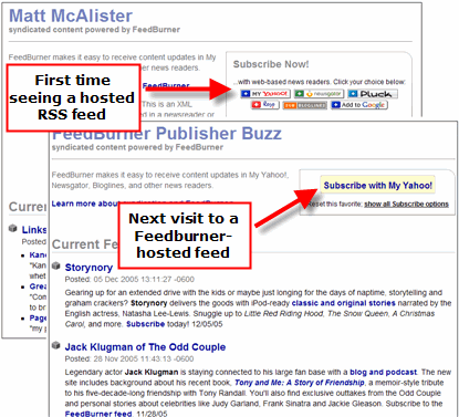
 I see today that Feedburner is offering a new way to enable users to quickly and easily subscribe to RSS feeds.
When you click on a link to a feed hosted by Feedburner, the page now
shows several options for which feed reading environment you
want. The interesting new element is that they are saving this
preference for users, which means that next time I click on another
feed hosted by FeedBurner I will automatically see a link to subscribe
via my chosen reader. This action is also enabled for podcasts.
I see today that Feedburner is offering a new way to enable users to quickly and easily subscribe to RSS feeds.
When you click on a link to a feed hosted by Feedburner, the page now
shows several options for which feed reading environment you
want. The interesting new element is that they are saving this
preference for users, which means that next time I click on another
feed hosted by FeedBurner I will automatically see a link to subscribe
via my chosen reader. This action is also enabled for podcasts.Feedburner continues to impress me with their innovations. The chiclet overload problem is not over yet, but the solution is working its way out with these kinds of UI improvements. There is obviously a race to provide publishers with the best solutions for distributing their RSS feeds. Focusing on making RSS invisible to users is the right direction, no doubt.
Speed to market is a winning strategy, too. In today's online game, staying competitive or jump-starting a market is about iterating ideas rather than producing robust, deeply engineered and fully tested solutions. Greg Linden questioned whether mashups were about giving big companies a way to outsource R&D for free.
"They offer the APIs so people can build clever toys, the best of which
the company will grab -- thank you very much -- and develop further on
their own."
While that may be partially true, have no doubt that the ambitions of many developers and small companies out there who are innovating quickly is to come up with a product or business model that becomes a big hit.
Feedburner isn't worried about being first to market and having their ideas stolen. They're trying to win.
Comments:
Re: Feedburner's new method for managing the RSS subscribe button problem
by
Cody Simms
on Thu 08 Dec 2005 12:07 AM EST
It is interesting that they are now not only supporting this feature for all of the various chicklets but also have a pulldown list that includes various desktop readers. Overall, this new landing page is a major step up from a UI perspective. Whereas before, I often felt a bit lost when I would get to a feedburner feeds page, the new landing page with the big "Subscribe Now" callout above the chicklets seems to give the page a bit more of an obvious purpose for people just trying to get into the RSS subscription game.