(Full announcement here: https://brave.com/announcing-brave-today/)
My media diet is never going to be satisfied by a single publisher. That said, most of the publishers I like have useful apps and give me a lot of what I want. The good ones have some visual appeal; they’re timely, relevant, and a pleasure to use.
Any publisher app is basically going to be disappointing, though because my preferred source of international political news is very rarely the source I turn to for financial coverage which is never the source I want for coverage of my favorite basketball team. And none of those will ever give me the insights I love from super niche publications about things like woodworking or classic cars.
The aggregators are better at serving a varied media diet, but I don’t want them to know my niche interests or even my broader interests, because that would mean even more precise data about me is being harvested which I really don’t want. It’s very disturbing when you read an article and then start seeing ads about that subject everywhere you go.
The only time I’ve ever felt like I had all the media coverage I wanted the way I wanted it was back in about 2005. When we had RSS and news readers I was able to tune my media diet using an app that fed headlines from tons of different publishers into one place. I loved adding new feeds as I discovered them. Even more than that, I loved turning off a feed I didn’t like anymore knowing that it was actually gone forever. They couldn’t retarget me or send emails or sell my data because they never knew who I was in the first place.
Admittedly, those of us who valued RSS readers most back then were probably excessive consumers of news and magazines and blogs with a high tolerance for geekery, unlike the wider population that had no time for the fiddly interfaces of tools like Newsgator, Bloglines and FeedDemon and the frustratingly ever-increasing count of unread items, much less the confusing buttons used for adding a feed to a feed reader. Even Google Reader was probably a bit too awkward for most people.
But that’s not to say the market hasn’t improved. The user experiences for scanning content are far better today, and the volume and variety of coverage has grown massively. We now have volume and variety within niches of niches in terms of how we interact with media, who is producing it, what they are producing, where it’s getting distributed, and how to profit from it.
The most important breakthrough that made all this possible probably wasn’t search or social distribution. It was the adtech that adopted the service oriented architectures of 2005 and learned how to track people and target them with messaging.
While the funding that resulted from the adtech innovations made it possible to evolve content apps and services, the deal included a massive sacrifice to our privacy on the Internet. At the time that trade would’ve seemed worth it. But it’s not worth it anymore. It’s not necessary, either.
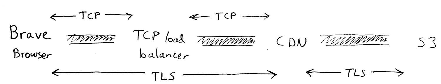
As Francois Marier describes in the blog post about Brave’s private CDN it’s possible for the app or provider to build a network-based service that knows nothing about the user consuming it and can’t know anything even if it wanted to.
In our case, to be more specific, the user’s request for content from the server gets encrypted and passed via an intermediary that can’t see what the user requested but sends the request message on behalf of the user to the server. The server can see the address of the intermediary for its reply and the contents of the encrypted message, but the server can not see the user’s address or any other data about the user. The server has no idea who sent it.
The work required to do this would’ve been total overkill back in 2005. Why would you do all that when at the time everything was clearly moving toward search and social which employed user tracking to get the most out of the ad business attached to it? Platforms and publishers wanted more data about users, not less.
Now that platforms and publishers have all been feeding this tracking ecosystem for the last 15 years the whole thing has gone way too far, but I still want my news and links to interesting things happening in the world. Can I have it with no tracking, please?
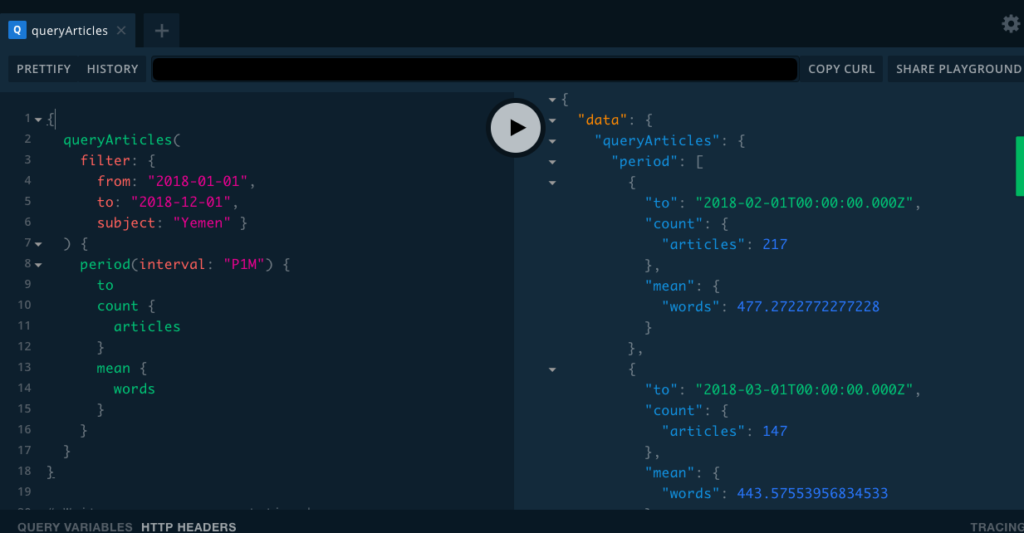
When a small team of us started working on a news reader at Brave a few months ago we were reminiscing about RSS readers and wishing the world still worked that way. We prototyped a concept that was initially going to use some APIs to gather headlines, but we found most of the feeds we needed to make it work. It turns out that most publishers are actually still using RSS. What a great surprise!
Why wouldn’t they? The format is an open standard with very basic output which makes it really simple to syndicate your content (see what I did there?). Most CMS’s generate RSS feeds automatically, anyhow.
We found the prototype to be surprisingly compelling. The only thing it needed was a modern privacy strategy and a business model. Both of those things come pretty easily to the team at Brave, and the prototype expanded into a proper news reader that we called Brave Today.
We didn’t want to wait too long to get a version into people’s hands and see how the market receives it. So, we prioritized the user experience, content delivery, privacy controls and advertising features first. But we have our eye on a fully open RSS reader that you can configure with feeds you find anywhere on the Internet. That would complete the bridge from 2005 to today which, if successful, could democratize content distribution on the Internet again as it was before Google and Facebook swallowed everything.
Lessons from the era are coming back to me as we progress, such as the importance of a great cold-start experience, the value of relevance and personalization in reducing the noise, constraining configuration options so it’s not confusing but offering enough to make the feed feel like your own. And then there are so many new capabilities available to us now that can make this old idea so much better this time around, particularly through mobile devices but also with other media formats. User behavior norms have evolved, as well, which means people are now totally comfortable with and perhaps even prefer having infinitely scrolling lists.
I’m pretty sure this is going to scratch an itch for a lot of people. It definitely will in my case, and I can’t be the only one who wants a modern news reader that preserves your privacy.